
I have dabbled with ClickBank for about a decade.
Sometimes as a vendor, sometimes as an affiliate, sometimes as the guy who creates pages which facilitate the flow of traffic through a ClickBank funnel.
It is that last category of ClickBank know-how to which I am going to add today.
I mm going to tell you how I recently incorporated advertorials into the arsenal of tools a ClickBank vendor can offer an affiliate so as to encourage them to promote.
So allow me a moment to better define exactly what we are talking about and then I will jump into the “how to” part of this article, which I think will be of most interest to vendors, but also to the occasional savvy affiliate…
Let’s Begin With A Definition Of ClickBank
ClickBank is essentially a marketplace which connects vendors (mostly of information products) to affiliates who will promote the vendor’s product(s) and earn a commission from doing so.
Typically vendors will offer affiliates 75 percent commission on any sales for which they are responsible.
So tracking each new customer back to where they came from (i.e the affiliate responsible for sending the prospect) is an important consideration whenever you set up your lead generation funnels – because affiliates really want and need to get paid for their troubles.
This arrangement allows the affiliate to concentrate on the traffic side of the business (finding tribes of people mostly likely to respond to the vendor’s offers) and the vendor to obsess over the product creation and customer handling.
The most successful ClickBank vendors are both leveraging the large ClickBank affiliate base AND they are driving their own traffic to their offers.
The simplest way to go about getting a sale is to drive traffic straight to the offer (sales) page.
But that is also usually the least effective way to get the sale. Especially if you are dealing with cold traffic, which is made up of prospects who have little idea about who you are or what your offer can do for them.
So instead of sending people to your offer, you (or your affiliates) will generally do better by sending prospects to a sign up page of some type. This is where you collect the name and email address of the prospect in exchange for something they consider valuable and you consider relevant to your offer.
For example, if your paid offer is a kidney cleanse protocol maybe you will offer a free special report on the top 5 foods known to cause kidney problems. This may not solve the prospect’s immediate “aching kidney” problem (your offer is intended to do that), but it may nonetheless seem like valuable-enough information to be worth the minor inconvenience of handing over one’s name and email address to get it.
Once you have that information you can slowly warm the prospect to the idea of purchasing your “full solution”. You can do this with a suitable email follow up sequence.
So now that we understand the role ClickBank plays in helping us secure affiliates to push traffic, let’s backtrack a step and consider the nature of the page at which the prospect first learns about you and your free guide, or whatever else you deem a suitable enough enticement to get their attention (and email address).
Anatomy Of A Squeeze Page
A common approach to getting someone’s email address is to put just enough information about your free resource onto the “above the fold” area of your landing page and include a sign up form. That way the prospect can make a decision about whether or not to bounce from the page empty-handed without needing to scroll or devote more than a few seconds to the task.
This is your traditional “squeeze page” approach.
It works great when your prospects have already been warmed to your offer.
For example, an affiliate might own a newsletter and message their subscribers about your offer (free downloadable resource). They will spend some time framing the offer before presenting a link to your page. So by the time the prospect arrives they already know what to expect. No need to attempt to figure it out from scratch. No necessity for anything more than an above the fold solicitation for the opt in. A well-crafted headline and bullets to match can be expected to do the job.
For warm traffic the traditional short copy squeeze page works great…
If you are creating the squeeze page and you want to offer it to affiliates to use you will generally need to do two things.
The first is to offer a custom “hoplink” (referral URL) that contains the affiliate nickname and (optionally) their tracking info (so they can trace a sale back to a particular campaign). The affiliate convinces the prospect to click on the hoplink. This momentarily redirects through ClickBank’s website where they record the referral and send the prospect on to the final destination (your squeeze page).
This is the minimum requirement to keep your affiliate happy. Because even if the prospect fails to opt in, the affiliate will still receive their commission if the prospect finds their way to your sales page and becomes your next customer.
But you can do more for the affiliate.
Like record the affiliate’s information into the autoresponder which accepts the prospect’s name and email address on your squeeze page.
If you do that (stash the affiliate nickname and tracking info) you can reconstruct the hoplink each time you follow up with a promotion of your product to the prospect. So whether it has been a week since the affiliate sent the prospect to you, or it has been a year, you can reconstruct the original hoplink and guarantee the affiliate gets credit if your promotion results in a sale.
This is the way I configure hoplinks to work with squeeze pages. It is what I consider the “traditional” approach to ClickBank lead generation.
Anatomy Of An Advertorial Page
Let’s now move on to the less traditional approach – one that involves using an advertorial for the landing page…
Until recently I had never created an advertorial.
But then I watched a training at Copy Chief on this topic. It was given by advertorial copywriter Rachel Mazza.
The tag line on Rachel’s home page reads: “Story-Driven Copy That Warms Up Cold Traffic and Lowers Traffic Costs”.
Perfect. Because the problem with the squeeze page is that it is not the optimal lander for cold traffic. The advertorial on the other hand has the potential to solve this problem.
The name itself suggests how:
Advertorial = Advertisement + Editorial
In other words it is a lead generation approach that uses a story, or other piece of “editorial” content, to whet the prospect’s appetite for more information by presenting a good chunk of it up front. Only then do you ask for their contact info.
Example: A sunglass company knows that one of the biggest hurdles to getting the sale is that prospects are confused by the ultra-violet ray protection classifications assigned to each type of glass or plastic lens.
So they create an advertorial that walks the prospect through the basics. When the prospect lands on the page they see an article with a headline that tells them they are in the right place:
“How To Select The UV Sunglass Filter That’s Right For Your Eyes”
The advertorial is a straight up offer of information. There is no sign up form visible on the page. There might not even be a sign up form ANYWHERE on the page, although there might be links to a sign up page sprinkled sparsely throughout the article.
Once I saw Rachel’s training I determined to create some advertorials of my own for the Ageless Brain promotion I was working on.
I wanted to create something that could be used as a landing page for cold traffic but have the same purpose as the traditional squeeze page, which is to get people to opt in for a free resource. At the same time, it needed to be able to be used by either the vendor or affiliates. So it had to support hoplinks and preserve any affiliate information passed to the page.
At first I begun with the traditional advertorial layout: a straightforward article with a few links to the squeeze page scattered throughout it. The squeeze page is where we really want the prospect to end up.
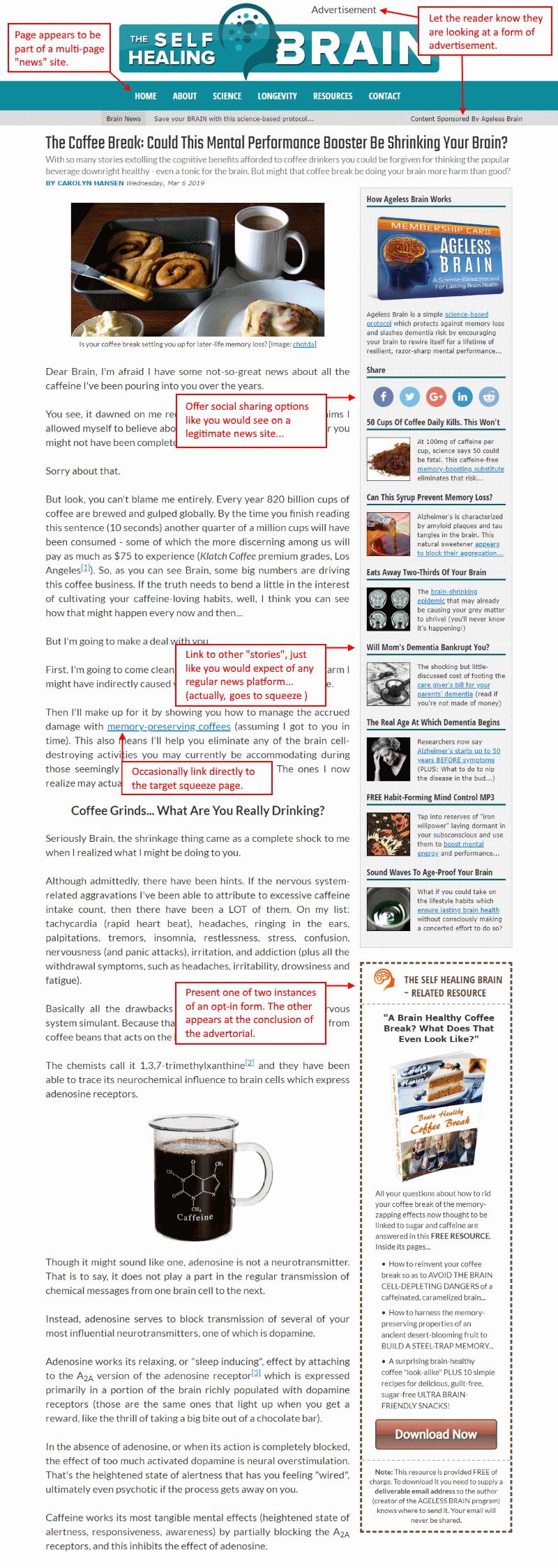
I modeled the landing page on a news site, which is typical of advertorial layouts.
I included site categories in the navigation bar, social sharing links, a scrolling news bar, links to other “stories” in a sidebar on the right of the page (the story links actually lead to the opt-in page). Then at the bottom of the page I placed links to other advertorials presented as more “stories”.
So far, so good.
Then, after I created my first advertorial and realized it was quite long I decided there would be no harm including an opt-in form at the bottom of the article. If the prospect had remained with me this far they surely were not going to begrudge an opt-in form to go with the short call to action included in the article summary.
After that it seemed obvious another opportunity presented itself in the right hand sidebar. So another instance of the opt-in form appeared there.
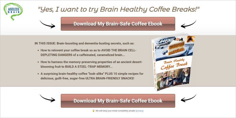
Here’s what the page looks like:
Click the image to get the complete “Coffee Break” advertorial experience!
If you visit this advertorial you will see that the article is much longer, and ends with a list of references alluded to in the article, links to “related stories”, and a disclaimer to the effect of: “This is an advertisement, so don’t be fooled by our clever presentation!”
The reason for the disclaimer is that if we should want to advertise on paid ad platforms it is likely they will want some kind of similar wording so that they cannot be accused by their users of presenting misleading content (a sales pitch dressed up as an article). For the same reason I have also included mini-disclaimers at the top of the page (as indicated in the image above).
Then at the very bottom of the page, also to keep advertising companies happy, links to Home, About, Privacy, Disclaimers, Terms of Use, and Contact Us pages. All the bases covered!
If I was passing affiliate nickname and tracking information to the page the URL would be appended like so: /nickname/tracking
This allows the opt-in form to pass that information into our autoresponder and also to pass the information from one page to the next in the group of advertorial pages linked to in our advertorial.
In practice, even though this appears to be a news site it is really a single piece of software creating the advertorial on the fly and linking to other “pages” which are just instances of the software invoked in a different way so as to put up an alternative advertorial or one of the auxiliary pages, like the About page.
The only time we directly link out of the advertorial is to link to the corresponding squeeze page for the advertorial, or link to the main offer (see the little branding exercise going on in the upper right area of the page, in this instance for the Ageless Brain program).
Otherwise the bulk of the page is devoted to presenting the prospect with some useful information which is tangential (or possibly directly) related to our main offer.
The advertorial is nothing new in marketing circles. It has been around for over a century.
Here is an example of one from 1956 for Campbell’s Soup with an emphasis on how to combine what is inside the can with milk from your refrigerator to make an extra-nutritious meal.
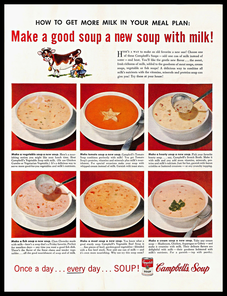
Looks like a David Ogilvy ad to me… [image credit: American Vintage Ads]
Some advertorials are much easier to write than others. It depends very much on how exciting the main offer is you wish to nudge your prospect towards.
Let’s assume you are willing to divulge secrets on how to easily make gobs of money with: “The 5 Golden Rules Of Small Cap Trades That NEVER FAIL”. In that case you will likely have no trouble getting your reader’s attention.
But what if you are selling insurance, or some derivative of it?
Then your job is MUCH harder.
Yes, everybody wants insurance, but nobody wants to pay for it. And it is definitely not fun to go through the purchasing process. Least exciting of all? Any discussion of why you need insurance in the first place.
In the case of Ageless Brain, the program is essentially an insurance plan, so I specifically chose to come at it sideways in my advertorials.
In the example you can see on this page (above) I target people who drink coffee (a huge demographic) and allude to the possibility that this cherished habit might be shrinking my prospect’s brain.
The hope is they will be curious enough to get into the article and by the time they finish it they will want to know more about how to improve their coffee breaks so as to remove the threat to brain size. Which incidentally I happen to cover in this free guide… Just add your name and email address to the form below and I’ll happily send it your way.
Advertorial Best Practices
Before wrapping this up, I should probably give you my guiding principles to creating an effective advertorial. This is a little presumptuous as I have only written three of these things to this point (all within the space of a few weeks).
So I am no expert.
On the other hand if you have yet to write your first advertorial perhaps these pointers will be useful…
- Present the reader with a catchy headline
This is obvious, right? But what will make it catchy and compel them to read on?- An announcement of something newsworthy is likely to work – i.e. a new discovery (“You may be entitled to a bigger tax refund than you thought.”).
- Something that contradicts an established belief (“That coffee break may be shrinking your brain.”).
- A personal story of good fortune or hardship (“The doctor assured her she would be fine. But then the mammography results came back… “)
- Summarize the nature of the article
Tell the reader in a sentence or two what it is they are about to learn, leaving no doubt in their mind that they at least want to read the first paragraph of your article. Then make sure the first paragraph makes them want to read the second… - Write in direct response copy mode
Keep providing information that propels the reader forward in your story. Above all else, provide value. Tell them things they will find surprising and suggestive of more important information to be revealed in later parts of the article. Use open loops, interesting characters, little-known facts and specificity to keep the copy moving. - Use hard-to-ignore subheads
These are the single-sentence declarations of what is about to be revealed in the next section. Your reader is going to skim your advertorial before they settle in (especially if your copy is on the longer side). So give them reasons to think your article is going to be worth their time. - Use images to support your claims
Or at the very least, use images to break up your copy (as you do with subheads).In one of my advertorials I use “retro” images taken from print magazine advertisements from the 1950s. They add the appropriate atmosphere to a story set around that period.
In another advertorial I slip in a scientific graph taken from a paper which supports the brain science I am discussing. Also photos of MRI scans and even a short 2-minute documentary video to reinforce my claim that sugar is the key driver of high cholesterol (which could sound crazy if you’ve not heard that claim before).
If your article is technical in nature, add a technical-looking image at the beginning, so as to suggest the explanation of it is sure to be found inside.
- Be subtle in the selling
Concentrate the bulk of your article on giving the reader exactly what they want. Do not hold back. Dial down your sales pitch entirely. Then in the final 10 percent or so weave in your call to action. You will have earned it. Now ask them to consider taking the next step in learning more. As Rachel Mazza says, your article should be designed to get your prospect to the next level of awareness about what it is you can offer them. The call to action is an offer to increase that level of awareness yet again.
OK, now I am all advertorial’d out.
I hope you found this useful.
Comments are closed.